Brand Book
Space
for more.
The visual identity of Kirjat House — a contemporary coastal lifestyle brand. More than somewhere to stay.
Positioning
More than somewhere to stay.
Kirjat House communicates place, lifestyle, belonging and breathing room. The feeling is contemporary coastal, editorial, warm, calm and human — never a generic resort template.
The Logo
The mark.
Primary horizontal lockup
Stacked lockup
App icon
Brand Voice
The language.
Space for more.
More than somewhere to stay.
Find your space.
Life happens here.
Everything you need. Nothing you don't.
Around here.
Come in. Stay a while.
Ready when you are.
Colour System
The palette.
Deep Teal
--teal
Medium Teal
--aqua
Peach Champagne
--sand
Deep Coastal
--coastal
Warm Shell
--shell
Soft Blush
--blush
Warm White
--warmwhite
Deep Ink
--ink
In context
 #004D54
Deep Teal
--teal
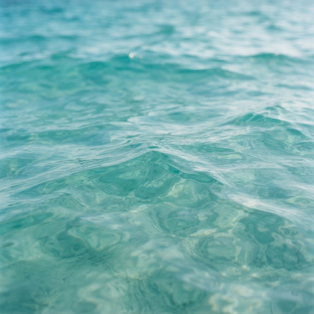 #209FA1
Medium Teal
--aqua
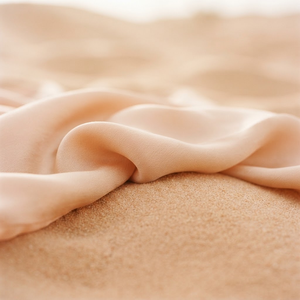 #E6C2A6
Peach Champagne
--sand
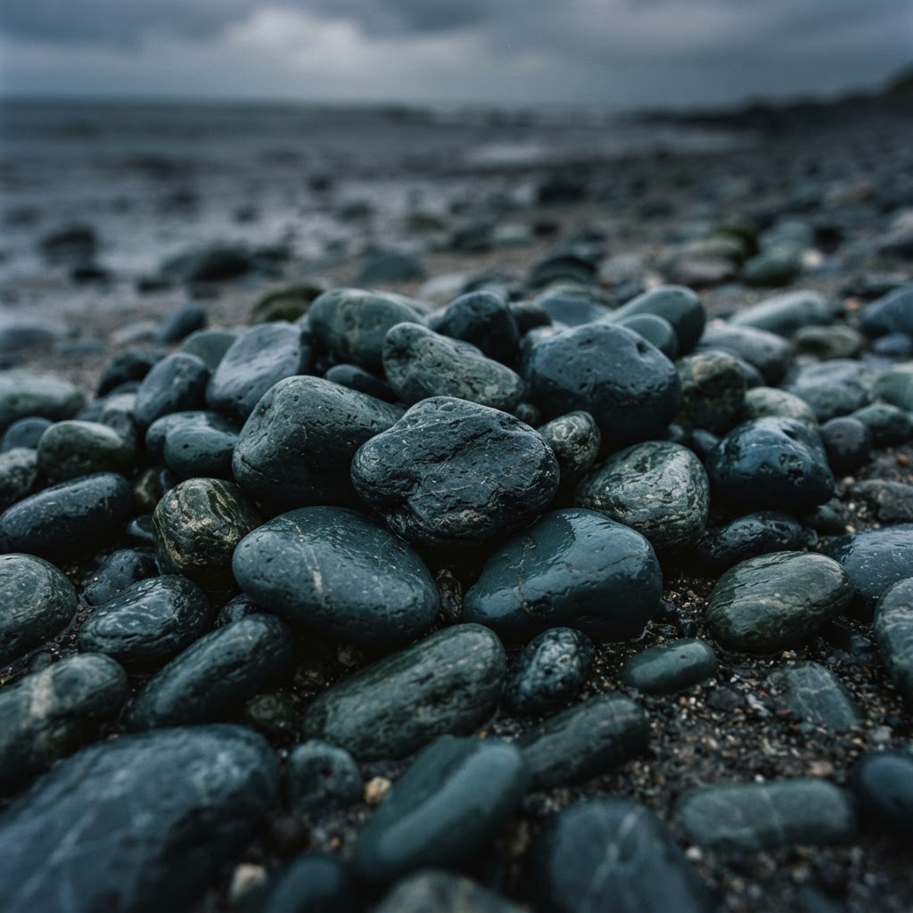 #2A5360
Deep Coastal
--coastal
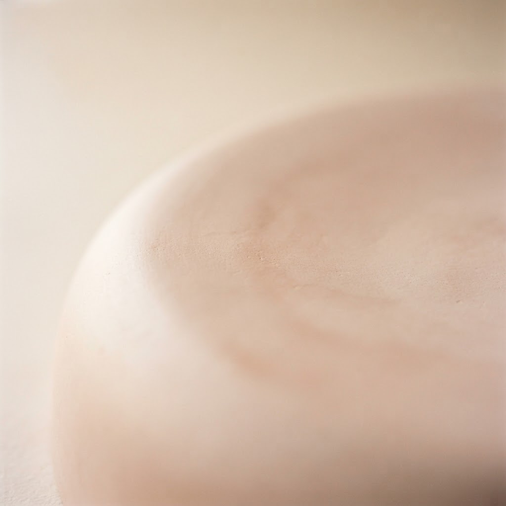 #EADBD4
Warm Shell
--shell
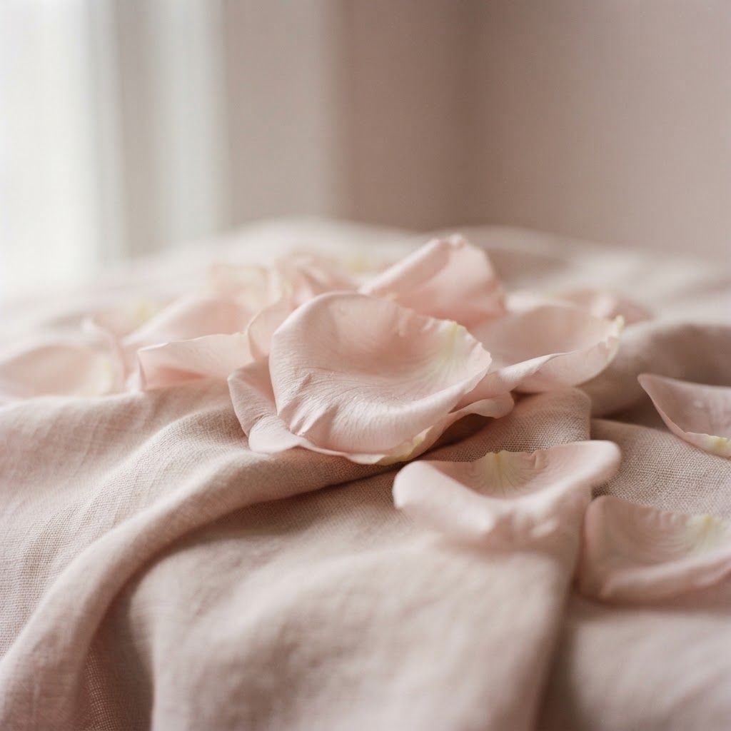 #E1CDC7
Soft Blush
--blush
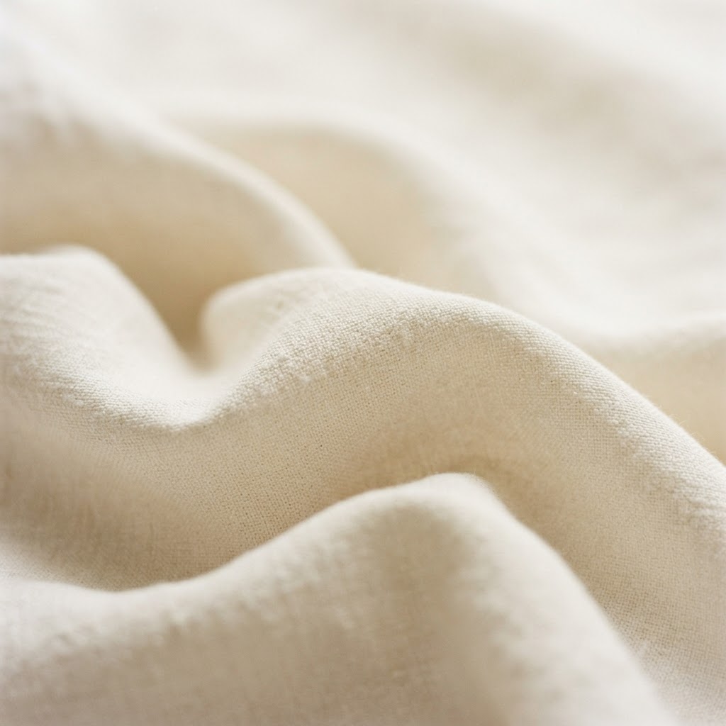 #FAF8F5
Warm White
--warmwhite
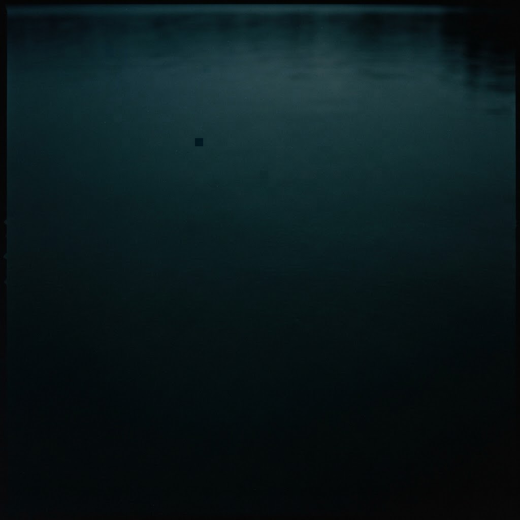 #17373C
Deep Ink
--ink
Light & fresh — Warm White is the dominant surface (≈35%).
Strong teal moments — Kirjat Teal + Deep Coastal anchor the brand.
Aqua as accent — Ocean Aqua for CTAs, stats and highlights.
Typography
Two voices.
Primary · UI & body
Figtree
Used for navigation, body copy, buttons, forms and labels. Restrained weights, generous line-height.
Aa Bb Cc · 1234567890
Display · Primary headlines
Manrope
The primary h1 font — confident, modern and geometric. Used for hero headlines and editorial moments across the site.
Space for more.
Brand Devices
The Kirjat Curve & The Circle.
The Kirjat Curve
A sweeping organic shape for photo masks, section transitions and CTA areas — often cropped partially off-screen.
Use circles sparingly — for numbers, map pins, carousel indicators and statistics. Never as polka-dot patterns.
Photography
Life at Kirjat.
Lifestyle imagery is warm, natural and human — golden light, coastal calm and candid moments. People, place and pause in equal measure.
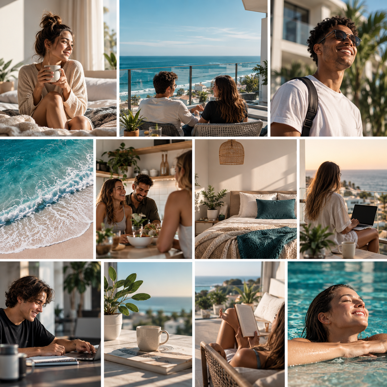
Warm & golden — Soft natural light, never harsh or over-lit.
Candid & human — Real moments over staged poses.
Coastal context — Always a sense of sea, sky and breathing room.
Components
In use.
Bedrooms
4
Bathrooms
3
Guests
8
Per night
R2590
Space for more.
Recognisably Kirjat House — even without the logo.